HTML Layout Templates
HTML layout templates are pre-designed website layouts that developers can use as a starting point for their projects. These templates usually include the five main sections that are used on any website: header, footer, navigation, main content, and sidebar. By using these templates, developers can save time and focus on customizing the design and content of their website.
Basic HTML Layout Templates
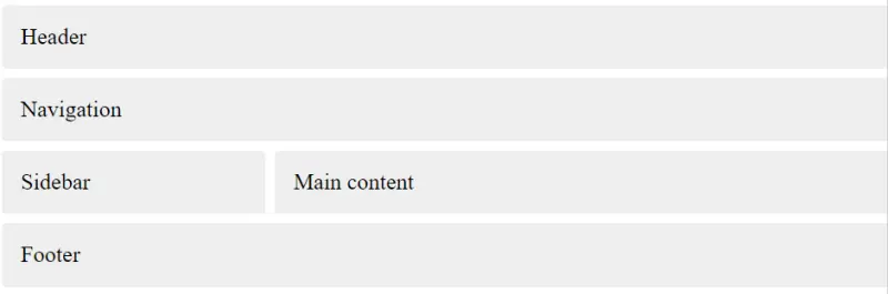
Grid Basic Layout
<!DOCTYPE html>
<html>
<head>
  <meta name="viewport" content="width=device-width, initial-scale=1" />
  <title>Grid Basic Layout</title>
  <style>
    aside {
      grid-area: sidebar;
    }
    nav{
      grid-area: nav;
    }
    main {
      grid-area: content;
    }

    header {
      grid-area: header;
    }
    footer {
      grid-area: footer;
    }
    body {
      margin: 0px;
      display: grid;
      grid-gap: 10px;
      grid-template-columns: 30%  70%;
      grid-template-areas:
              "header  header" "nav nav" "sidebar content" "footer footer";
    }
    aside, nav, main, header, footer {
      background: #EEEEEE;
      border-radius: 5px;
      padding: 20px;
      font-size: 150%;
    }
  </style>
</head>
<body>
  <header>Header</header>
  <nav>Navigation</nav>
  <aside>Sidebar</aside>
  <main>
      <section id="content">
          Main content
      </section>
  </main>
  <footer>Footer</footer>
</body>
</html>
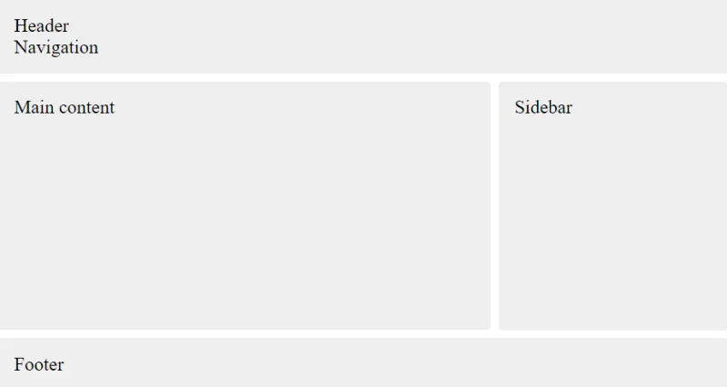
Flexbox Basic Layout
<!DOCTYPE html>
<html>
<head>
  <title>Flexbox Basic Layout</title>
  <meta name="viewport" content="width=device-width, initial-scale=1" />
  <style>
    body {
      display: flex;
      flex-direction: column;
      min-height: 100vh;
      margin: 0;
      gap: 10px;
    }

    #wrapper {
      display: flex;
      flex: 1 1 auto;
      gap: 10px;
    }
    #wrapper main{
        flex: 1 1 70%;
    }
    #wrapper aside{
        flex-basis: 30%;
    }
    @media (max-width: 769px) {
        #wrapper{
            flex-direction: column;
        }
        #wrapper main, #wrapper aside{
            flex-basis: 100%;
        }
    }

    aside, main, header, footer {
      background: #EEEEEE;
      border-radius: 5px;
      padding: 20px;
      font-size: 150%;
    }
  </style>
</head>
<body>
  <header>
    Header
    <nav>Navigation</nav>
  </header>

  <div id="wrapper">
    <main>
        <section id="content">
            Main content
        </section>
    </main>
    <aside>Sidebar</aside>
  </div>
  <footer >Footer</footer>
</body>
</html>
HTML Layout Techniques
There are 4 common techniques used for creating multicolumn layouts in HTML and CSS. Here's a brief overview of each:
- CSS Frameworks: CSS frameworks such as Bootstrap, Foundation, and Bulma provide a set of pre-built HTML and CSS templates that developers can use to create complex layouts quickly. They come with built-in components, such as navigation bars, forms, and grids that make it easy to create a responsive and scalable website. The advantage of using CSS frameworks is that they provide a consistent and robust design system, which saves time and effort in designing and coding.
- CSS Flexbox: CSS flexbox is a modern technique for creating flexible and responsive layouts. By using the flexbox model, you can create a container and place child elements inside it. The container can control the layout, size, and alignment of the child elements. Flexbox is easy to use and is supported by most modern browsers. The main drawback of using flexbox is that it has limited support for complex layouts and can be difficult to manage with multiple nested elements.
- CSS Grid: CSS grid is a powerful layout technique that allows you to create complex and dynamic layouts with ease. With grid, you can define rows and columns in a container, and place child elements within them. Grid provides advanced features such as auto-fit, grid-gap, and alignment controls that allow you to create responsive and scalable designs. Grid is well-supported by modern browsers, but has limited support in older browsers.
- CSS Float Property: The CSS float property is a traditional technique for creating multicolumn layouts. By using the float property, you can position elements to the left or right of their container, allowing you to create columns. The main advantage of using the float property is its backward compatibility with older browsers. However, it has limitations in creating complex layouts, and it can cause issues with element positioning and layout stability.